Friday, 30 March 2012
Saturday, 10 March 2012
Evaluation of the finished media product
Our title sequence in which my group and I created consists of the stereotypical conventions of a psychological war-based thriller, as for example the primary conventions of this particular genre are as follows:
- Violence
- As a group, we endorsed this particular convention, by the fact that during our title sequence, there is a violent scene in which consists of two of our featured characters. the violent scene includes a gun shot; and of course the prop of a gun shot sets off the connotation that violence and potentially death is involved. Overall, however I am pleased with the way my group and I have tackled this particular convention as we have stuck to the stereotypical psychological war thriller theme.
- Death
- The involvement of two or more nations
In addition, the title sequence in which we created features all of the basic, primary conventions/criteria in which are usually found within title sequences. For example, we endorsed, text, music, & on screen natural footage. We challenged these particular title sequence conventions by the fact that we carefully selected and worked towards what sort of music, titles and text we wanted to be on our title sequence’s footage. The benefit of building upon the primary conventions of title sequences was that we was able to make our title sequence seem professional and of course a significant effect of realism.
How does your media product represent particular social groups?
The media product in which my group and I created represents the middle – class and predominately average male social group. I would say that our title sequence represents this specific social group mainly due to the narrative in which our media product consists of. For instance, our title sequence is set during the 1950’s and of course during this period of time the cold war was in action. The cold war connotes to the audience violence and of course conflict in which is occurring between both Americans and Russians; therefore our media product is an iconic representative of older teenagers/young men as during the cold war this particular social group were involved.
Furthermore, our media product represents our targeted social group in a fair, equal and undivided way. For example, as a group we decided to show both the American and Russian perspectives of the cold war. The purpose of showing both point of views is that our title sequence would become of more great importance as we would attract a larger range of an audience. In addition, the popularity would significantly grow due to the fairness in which we demonstrated.
Our media product does not target a particular ethnicity or religion as during the cold war, religion and ethnicity was not a significant factor in which was involved. Although the predominantly involved ethnicity during the cold war was white, we decided not to target solely this ethnicity as our title sequence does not entirely represent the white race. In fact our sequence does not target or represent any ethnicity at all; therefore as a group we represented a a middle class social group with no dependant on ethnicity.
Overall, I am pleased with how our title sequence represents our social group as we carefully decided which social group best fits into the category of our media product.
What kind of media institution might distribute your media product and why?
As a group we each individually researched into different film distributions and film companies. After researching into film distributions, we came across the ‘big five’ film companies. After doing relevant information on the ‘big five’, as a group we agreed that there were only three film studios/companies who were realistically able to distribute our film due to our high budget which ranges between the cost of $80 million - $100 million. Therefore as a group we knew that only either Warner Bros, Universal or Paramount could distribute our film, as they are the most popular and able media institutions who can distribute our film.
After a long process of research and thinking we came to the conclusion that Universal shall be distributing our film due to the fact that they are highly recognized and popular film institutions who have the appropriate experience to distribute big, great and high budget films. Universal have previously demonstrated the evidence in the past that they have produced and distributed big budget films in the past. For example, Universal distributed the film "The Incredible Hulk" in which had a budget of $150 million; therefore we had not doubt as a group that Universal would be the most ideal choice to distribute our film, especially seeing as they the necessary amount of money, and also the facilities ot distribute our film.
Who would be the audience for your media product?
The audience for our media product is late male teenagers who are aged between the ages of 15-19. We agreed to have this particular audience as our demographic audience as they are the most suitable demographic to go out and pay money to watch a film which is about the cold war.
Our narrative also features a violent scene in which involves the shooting in one of the characters; therefore the most appropriate age range had to be 15+ as any age range below 15 would not legally be able to contain a scene of violent nature. The BBFC also claim on their website that any forms of violence is not granted permission or an age range below the age of 15.
How did you attract/address your audience?
As a group, we addressed our audience in a numerous amount of ways, but specifically we decided to attract our audience by making characters have a high sense of verisimilitude through the use of stereotypical 1950’s clothing (Trench coats, Russian style hats). I would say that by portraying the characters in our title sequence like this is useful as it connotes which era our film was set in.
Our primary target audience was male old/late teenagers aged between 15-19. We decided to address and attract this particular demographic mainly because they are the most relevant demographic profile to go out and watch our film due to our film being tied in with the theme of the ‘Cold War’. I strongly feel we attracted our particular audience mainly due to the fact that we used the most appropriate props in which we could find. Our main props being a classic, retro gun and of course fake blood in which seemed as original as possible.
The secondary target audience of our title sequence was once again males but this time aged between the ages of 21-35. The purpose of having this particular audience profile as our secondary target audience was the fact that they too would be the most likely to go out and watch a film in regards to the cold war. Furthermore, before coming to a conclusion on which audience profile we should target, i made sure individual research was conducted. The purpose of researching on an audience is that an individual can become aware and informative of a particular audience's profile and their preferences when it comes to what sort of film they are most likely to watch. As a group, we attracted our secondary target audience through the use of characters and props in which were used throughout our sequence. Of course, the props in which consisted in our sequence had a high quality sense of verisimilitude and this connotes the more realistic a sequence is, the more likely a particular audience are going to enjoy the film.
During our title sequence we also set up an iconic enigma, our enigmas being we made our audience wonder what will happen next, will the character eventually die? What was the purpose of the archive footage? All of course is revealed during the end of the title sequence. The inclusion of an enigma of course denotes an intriguing title sequence in which will leave our audience questioning. This of course attracts our audience, as they’ll be gripped with what’ll be happening next.
In general, I believe that my group and I attracted and addressed our audience successfully mainly because we carefully took into consideration what our audience like and throughout my blog as you will see I created feedback forms from our target audience. The benefit of feedback forms was that during the creation process, we were able to take on board feedback from our audience, in order to ensure we were targeting and addressing them appropriately and correctly.
What have you learnt about technologies from the process of constructing this product?
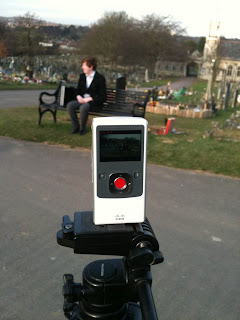
I must admit that I especially have learnt a lot in regards to technologies during the constructing of our title sequence. As for example, I was assigned the role of ‘director’ and the primary filmmaker during the creation of our product. The benefit of being assigned this role was that I could not only film our title sequence but I also could become even more informative and knowledgeable with how the camera equipment works out. To film our media product we used a flip vide camera in which I must admit is a handy piece of equipment. I had previously used this piece of technology before, but not to its full extent.
In particular, I learnt how to zoom in and zoom out whilst filming for our title sequence. Although our final edited product does not feature any zoomed effect, I still think the fact that I learnt how use this particular effect was beneficial, just in case as a group we needed to use the zoom effect.
Furthermore, during the beginning stage of the construction of our media product, each individual was required to create their own blog, and I must admit that it was the first ever time I properly used a blog. For instance whilst updating my blog I learnt several things. These things ranged from uploading images to my posts all the way to simply hyperlinking information to my posts. In general, I am extremely proud with my blog and how it has shaped up. I have overall, over 50 posts which in my opinion is incredibly useful as each individual post represents how far we have gotten up to during the construction of our title sequence. All of my posts are of great significance and they demonstrate each process during the process of our title sequence.
Another useful piece of technology in which I have learnt is how to use the editing software during the editing process of our product. As a class we were given a particular lesson dedicated with how to use ‘Final Cut Pro’ and I feel this lesson was a huge success as I learnt a lot with regards how to use the editing software. Although I was not the primary editor of my group, I still believe by learning the basics of ‘Final Cut Pro’ was extremely helpful; just in case our editor of the group was having problems with issues, but fortunately everything went according to plan. I managed to edit one small particular scene, and I must admit I was pleased with the piece of the sequence I edited as it featured a lot of different editing techniques, like: Match On Action, Cross Cutting and a Shot Reverse Shot.
Looking back at your preliminary task, what do you feel you have learnt in the progression from it to the full product?
As a group, we each individually feel that we have learnt a lot during the progression of our title sequence compared to what we each initially knew from the preliminarily continuity editing task.
One of the main aspects in which I feel I learnt and improved heavily upon during the creation of our title sequence was the editing element. For instance, during the editing process of our continuity editing sequence, I was not informative and confident with regards to how edit properly. So for example, I did not even know how to add text; however during the editing process of our title sequence I felt confident about how to edit and use the editing software in which we used.
In addition, during the filming process of our continuity sequence, I did not know how to use lighting to a significant effect. For example, I was not aware of high key, low key and natural lighting. However during the filming of our title sequence my group and I in particular took into careful consideration how the lighting can be used in it’s most effective and suitable way. Fortunately the lighting in our final completed title sequence was used appropriately and to a significant effect. The lighting throughout our sequence was both high key and natural lighting. This of course connotes to our target audience that lighting was carefully constructed.
Another key element in which I can admit I made progression on was the cinematography element; as during the preliminary task, I disappointingly did not use a range of camera angles/shots and consequently this showed up whilst editing our continuity sequence (Preliminary Task). However when it came to brainstorming ideas for our title sequence, I made sure I got across how important cinematography is during any media film. Furthermore, when it came down to storyboarding our media product, we used a variety of different camera angles, some of these shots being: Close-up, extreme close-up, mid-shot, long shot, point of view and worms eye view. The benefit of using all of these particular shots/angles was that our product became much more professional, and of course a professional title sequence connotes to the audience in general, that behind our sequence was a professional team which resulted in a successful title sequence.
Overall, I individually learnt a lot of things during the creation of our title sequence in comparison to the preliminary task; and the benefit of this was that I specifically could make clear signs of progression throughout the year. On a final note, I must admit that I am very happy with regards to our title sequence due to the professionalism in which was involved. I believe each individual group member has contributed fairly within the group to help produce a successful piece of a media product. Of course during the preliminary task, we were selected in groups and this was of great benefit as I was able to gel with other team members in which became beneficial when it came down to the creation of our title sequence.
Wednesday, 29 February 2012
Journal - Week 11
- How does your media product represent particular social groups
- What kind of media institute might distribute your product and why?
- What would be the audience for your media product?
- How did you attract/address your audience
- What have you learnt about technologies from the process of constructing this product
- Looking back at the preliminary task, what do you feel you have learnt in the progression from it to the final product
- Carry on with the completion of my evaluation.
- Make sure our title sequence is finally edited and finished.
Wednesday, 22 February 2012


Tuesday, 21 February 2012
Journal - Week 10
On the last Friday before half term, we were required to show and present our title sequences. Therefore during our first lesson on Friday we consistently worked hard on the editing process. After our first lesson, we came back to the classroom and we were chosen to present our title sequence first.
I would say our first draft of our title sequence worked well mainlybecause the audience in the classroom provided us with postive feedback as well as some negative feedbck.
The positive feedback we received was as follows:
- Our idea had a good concept
- Our title sequence was well structured
- The typography in which we used was releavant to our title sequence
- In general our mise-en-scene was brilliant
The negative feedback we received was as follows:
- Our editing can be improved
- To shorten our title sequence
- To remove unneccesary examples of cinematography
Explanation of the feedback we received:
Overall, the feedback in which we received was of great significance as we received positive and negative points in regards to our first finished draft of our title sequence. As a group we shall take the feedback we received on board mainly so that we can alter and improve on our first draft of out title sequence.
The negative feedback in which we received shall also be beneficial to us as a group mainly due to the fact that we shall take our negative feedback into consideration and based on the comments we were given we shall alter our title sequence!
However in general, I am pleased with the comments in which were given to us especially seeing as we now know how to improve upon our title sequence.
What's next for us as a group?
My group and I should now begin to continue editing our tilte sequence by taking into consideration the feedback we received. This week eaach individual groujp member should also be starting to think and brainstorm what we shall write on our evaluation. I personally shall be brainstorming within this week; and hopefully during this week I should be able to make a start on my evaluation on our finished title sequence.
Wednesday, 8 February 2012
Our other location shots
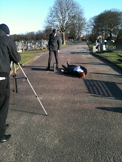
Below are a selection of images in which we took on the location in which we filmed on Friday. As I mentioned on previous post (Journal Week 9), we decided to film in a Cemetery. The benefit of filming in a cemetery was that we could capture an interesting and intriguing setting.


Monday, 6 February 2012
Journal - Week 9
- We have finished the filming element of our title sequence
- We have commenced with our editing
- We have successfully added our typography designs to our title sequence
Wednesday, 1 February 2012
Our New Location Shots


Monday, 30 January 2012
Journal - Week 8
- Continuing to shoot our title sequence
- Use a new location. This location being the Church.
- Firmly begun editing.
- Continue with editing our title sequence.
- Film the last few remaining shots of our title sequence.
- Post our final location shots.
Friday, 27 January 2012
Location Shots - What went wrong?


Tuesday, 24 January 2012
Journal - Week 7
- Commenced with the filming of our title sequence
- Began shooting in a different location
- Uploaded 'tester' footage
- Completed further Audience Feedback forms with which logo we are going to use
Audience Feedback Logo Results & Explanation


- The logo's colour scheme is interesting mainly because it is so simple yet so effective to our film
- The font is bold and meaningful; this therefore gives our target audience the impression that our company logo fits in with the genre of our film which is of course a psychological thriller set in the 1950's.
Monday, 23 January 2012


Testing Filming Location
- The location is isolated which is exactly what sort of location we required.
- The camera angle used is interesting as it shows the character from an observant angle.
- The sound isn't irritating and it also doesn't take control of the clip which is exactly how we wanted the sound to be like.
- We could possibly use a different location mainly so that we can have a more exhilarating location in which portrays a more meaningful message.
Monday, 16 January 2012
Journal - Week 6
- Created and handed out Audience Feedback forms.
- Received our audience feedback forms back and explained what the results were.
- Choose our final Typography Design.
- Research for what Music/Sound we shall be using for our title sequence.
- Began to film.
Audience Feedback


Our Storyboards


- They have been carefully drawn; therefore they shall be easy to follow.
- We have used colours to illustrate our drawings. This shall be beneficial to us as a group mainly because we will be able to quickly focus on which individual shot is which.
Friday, 13 January 2012
Final Edited Typography Designs

- The colours represent what our title sequence is about - The fact that we have used black and white colours portray that our title sequence was set during a period of time in which colours weren't around.
- The font is bold which is good as a bold font suggests to our target audience that our film is meaningful

- Once again the colour scheme is effective mainly because the black and white font used shows a purpose and in addition, the colours black and white gel well together
- The font style used is also bold. The fact that the font is bold implies the feeling to our audience that our title sequence shall foreshadow a powerful meaning.
Thursday, 12 January 2012
The Music for our Title Sequence
Where will we get the music from?
We have not yet decided where we shall get our music from however as a group we shall be taking a look at copyright free music mainly due to the fact that we do not want to use music in which is in use of copyright.
There is a good website in which has lots of samples of copyright free music. This website being: http://AudioNetwork.lgfl.org.uk
I have had a brief look at the website and I must admit there are lots of free music samples from a range of different genre's.
As a group, we will have to take a look at this website together and decide on an approprate music sound.
What are the other possibilities?
- We could possibly create our own music - By creating our own music we will have a better understanding of what we want to get on to our title sequence (Music Wise)
- If there is a particular piece of sound we like we could write/e-mail the music company and kindly ask for their permission to use their copyright material.
Overall however, I would say at this moment of time we are looking for samples of free music on the website I listed above; therefore this is our first choice at this moment of time.
Google Calendar - Explanation
- I like the fact that the Google Calendar is easy to read, so for instance I am able to easily access the details in which have been added to the calendar
- The colour scheme is bright - The inclusion of the colour red is beneficial as it makes our calendar is seem more attractive and eye-catching.
- The text size is rather small; therefore I need to change the font style so that I can make an adjustment.

Journal - Week 5
Monday, 9 January 2012
Animatics video of our storyboard
- The animatics video consists of all of our shots in chronological order; therefore this shows clear organization
- The video isn't either long or short; therefore it is an appropriate length
- A small proportion of the images are out of focus; therefore they seem unclear however they are still understandable.
Sunday, 8 January 2012
Shot list for our Title Sequence
As a group we decided to re-do our storboard mainly so that we could become more organised and structured as a group. Additionally, I personally was not entirely clear of what was happening during our initial storyboard; therefore we all as a group decided to start off our shot-list/storyboards up from scratch. We swiftly made this decision during a meeting in which we organised.
During this meeting, we discussed what was going well and what wasn't going well. Fortunately after the meeting we as a group became more united as we had let all our problems and differences out and aside.
What shall consists during our storyboard (Our Shot-List):
1.) Universal Studios Credit
2.) Our Production logo credit (Star Productions)
3.) JFK Archive Footage - Length of shot approximately 10 seconds maximum
4.) Leonardo DiCaprio Credit (Main Character) - Black screen shot
5.) Mid-shot in the position of behind the man - Tracking shot - Character walking down a corridor
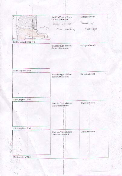
6.) Close-up shot of lack shoes in which the character being filmed is wearing
7.) Close-up shot of a retro suit in which the character is wearing
8.) Close-up shot of black gloves. This shot shall connote power
9.) Another close-up shot of the back of the charatcers head
10.) Close-up shot of the character's mouth being filmed
11.) Black screen credit (Co-Starring Colin Hanks and Rosie Huntington)
12.) The Boss (Other Character) looking out a window drinking - Shot from behind
13.) Shot approaching the door
14.) Midshot of door
15.) Close-up shot of door handle opening
16.) P.O.V Shot - Entering Room - Shooting man - Split storyboard in half to show both actions (Same Shot)
17.) Midshot of dead man with briefcase in shot (Significant) (MidShot) Also showing the other man leaving with the black briefcase
18.) Edited Credit/Cinematography Credit/Music Credit - All in one shot
19.) Leaves through the door shot
20.) Close-up of window. The man being the main focus - The door being aside and out of focus
21.) The man enters through the door - This then leads to the Producer Credit
22.) Editing Cut to the man in the window - Mid Shot - The other man also enters this shot.
23.) Close-up shot of briefcase being handed over to show sign of power and significance
24.) Mid Shot of window man with briefcase - The Director Credit then arises
25.) Editing shot - Fading effect into the title of the fil "The Iron Curtain"
26.) Iron Curtain Credit - Final Shot
Wednesday, 4 January 2012
Journal week 4
What have we done this week?
This week in media we have managed to continue our storyboards. Group members Sam and Ryan insisted that they were to take charge of the storyboards, however I feel as if this was not a good idea mainly because we are a group of four; therefore all four group members must work as a team, and no-one should take charge without any consent of fellow group members.
How shall I resolve this problem?
I believe I will be able to solve this problem by conducting a team meeting and explaining that my group members must be sufficient and professional whilst working as a team. For example, we MUST have a good stable and reliable form of communication. I strongly suggest each group members exchange mobile phone details and/or e-mail contacts. I have sent my e-mail address to al of my fellow three group members.
What's next for our group?
As a GROUP we should be completed with our storyboards by Friday; therefore hopefully next week, we can possibly begin to film. However before we begin to film, we must organise the location in which we will be filming from. This week we began to brainstorm possible locations as it seems that our original location may not be successful. I am aware that our storyboards consist of a supposed man walking down the corridor; therfore it is probably best that we look for a corridor and a room to shoot for our title sequence.
Monday, 2 January 2012
More typography fonts for our title sequence
Why have we decided to create more typography ideas?
We as a group have created more typography fonts mainly so that we will have a selection of different ideas when it comes to editing our title sequence. The fact that we have created more typography fonts evidently proves that our group is versatile and hard-working.
What is the purpose of using different fonts in our title sequence?
The purpose of using different fonts in our title sequence is that our target audience will get/receive an insight to what our film is about, judging by the look of the typography we have created and endorsed.
Below are our American style fonts. We have organised our typography fonts into two sections. These sections being American & Russian.

The above font was created by group member Sam. Sam created this American style font by accessing the font website entitled DaFont.com.
What do I like about this font?
- The font is bold; therefore it shall attract our target audience even more mainly because it is eye-catching and meaningful.
- The font is rather attractive. The font looks attractive through the way the letters have been designed. For example the lettering seems retro and old-school, however at the same time the font feels modern and recent.

This American style font has also been created by group member Sam. In addition, this font was also created with our groups supervision, guidance and input.
What do I like about this font?
- I like the fact that this font has an energetic and powerful look towards it.
- This particular font also seems incredibly American. Therefore this shall benefit us as a group mainly because by using this font, our title sequence shall be more identifying and prolific.
Russian Style Fonts:
Blow are two more Russians style fonts in which we as a group created.

This Russian style font was also created by popular font website Dafont.com. As a group, we have decided to create almost all of our typography fonts with Dafont mainly because Dafont is reliable and effective.
What do I like about this font?
- This font is easily recognizable; therefore this shall make our whole title sequence seem recognizable by using this piece of typography font.
- This font also seems effective as it is unique and has a signature feel towards it.

This is the second of two Russians tyle fonts we have created during the holidays. This typography font is also of course a Russian Style font in which was created with Dafont.
What do I like about this font?
- The font is eye-catching as it is not your 'regular used font'.
- The lettering is distinctively Russian in which makes the typography more meaningful and useful.